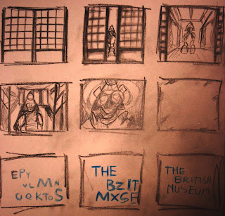
 I started of by sketching a storyboard. I wanted the door's to slide back to reveal a Japanese setting . The camera would then zoom in to the Samurai, his eyes would glow white and the the font would appear.
 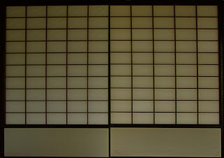 This was my first layer in photoshop I had to layer them separately so that I could animate them separately in after effects.
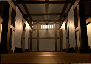 This is the image before I edited it.
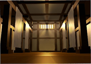 I then highlighted the areas of light to make it look more dramatic.
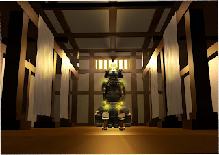 Finlay I placed the Samurai inside and highlighted him also I added the glow effect in After effects. The samurai was taken from my own photograhs, which helped as the resolution was high, i searched on google but could find any which were high res or at the desired angle.
Creative Process
- Used images and layered them on photoshop
- seperated the layers so that I could animate them in After Effects.
- Highlighted select parts or my layers to look good
- Positioned the Anchor point so I could move the doors from a certain area.
- Keyed the doors until the movement looked smoothe
- used the graph editor to create the right motion
- used the scale tool to give the illusion the samurai was coming closer
- changed the opacity so level lit up as the doors openend
- created fast blur so the doors looked more realistic as they opened
- placed blur onto samurai so that he did not look to sharp when the doors opened
- placed blur on to background so the Samuari stood out as I zoomed in
- added glow effect to the samurai eyes
- placed white out so it appeared as if the eyes lite up the whole room
- used present typography
- duration 5 seconds
Premier
- used soundtrack
- used Sound effect from uni hard drive
- placed sound effect on Dore
- rendered to desired format
- duration 5 seconds
I also was realizing the importance of tidy file management, as I would end up having some many video files which were slightly different I may have changed them due to their poor quality or general changes . In future projects I will create a separate folder for test files. This would make my work space allot more manageable
No comments:
Post a Comment